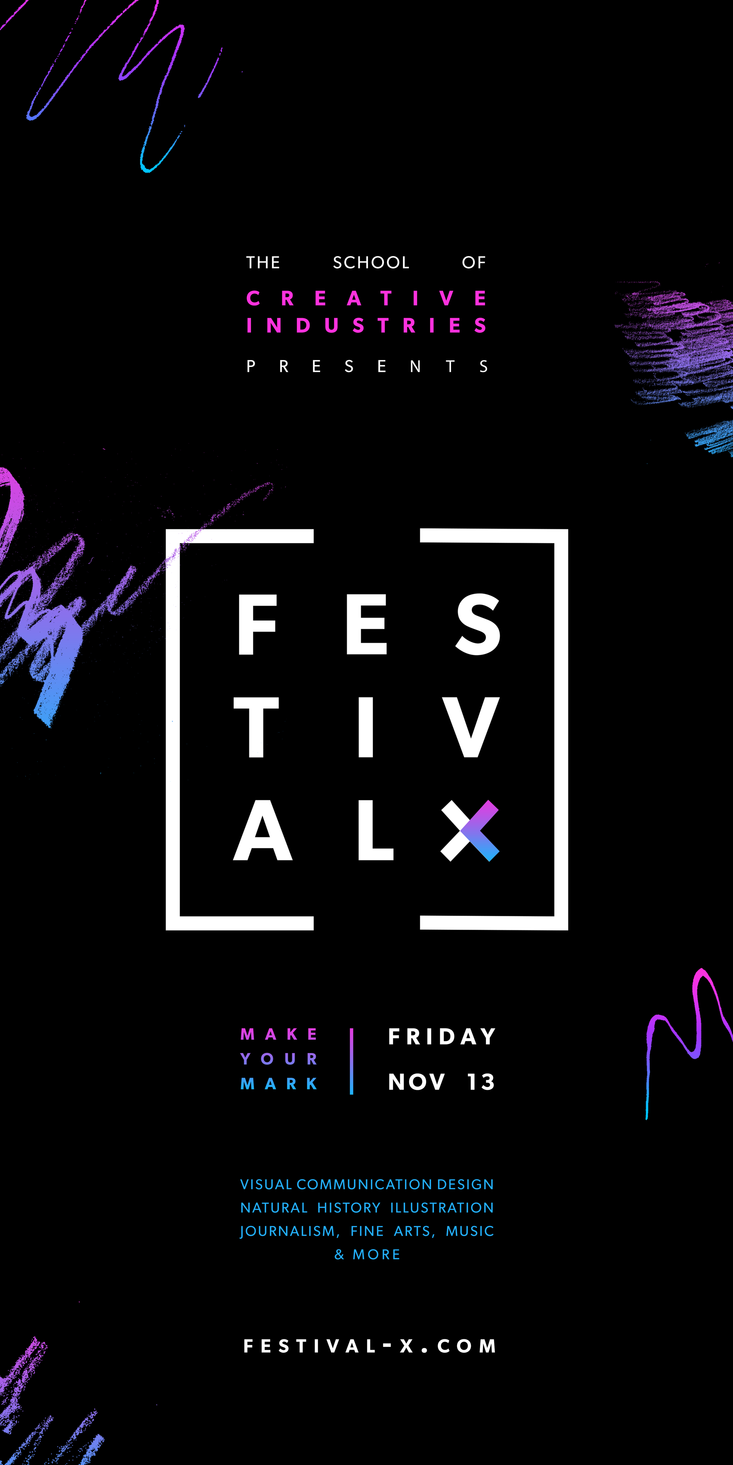
For my final year of University I was fortunate enough to be selected to work with a small group of my fellow designers to create the brand identity for the University of Newcastle’s Festival X, an annual festival that displayed the works of graduating students from;
Visual Communication Design, Natural History Illustration, Journalism, Music, Creative Industries, Fine Arts & More
The aesthetic went through many stages, below you can see a collection of some of my early experimentation with the brand identity of the festival.


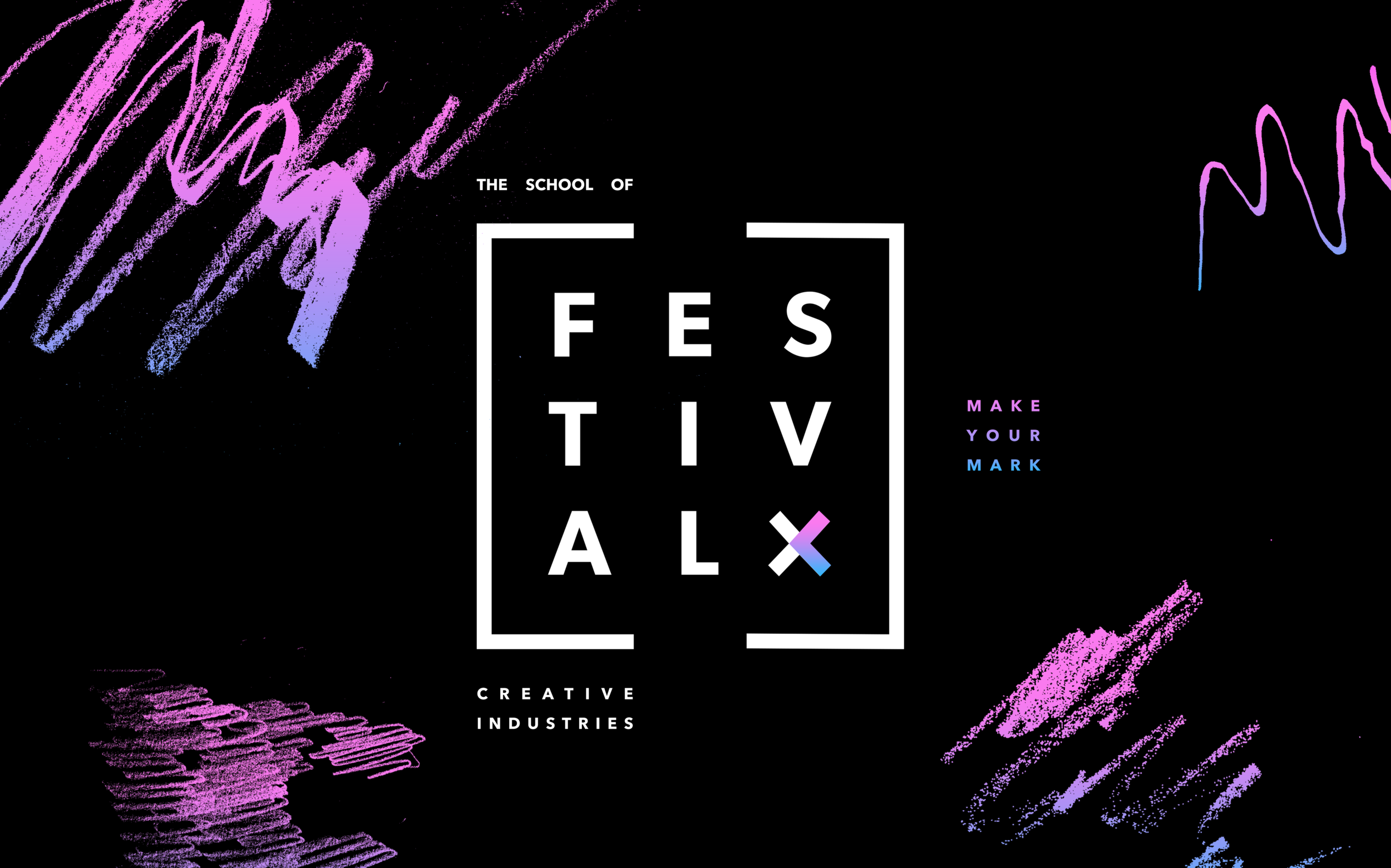
Final Design
For the final design we decided to incorporate the letters into a 3x3 grid used from the previous year, but changed it up with the inclusion of a border around the text to give it some fresh elements. The ‘x’ variation allows for applicability to wayfinding and motion graphics. For the colours we chose pink, blue and black to make for a contrasting eye catching design and included decorative scribbles to celebrate those getting creative with physical media whilst in isolation.